Sample answer
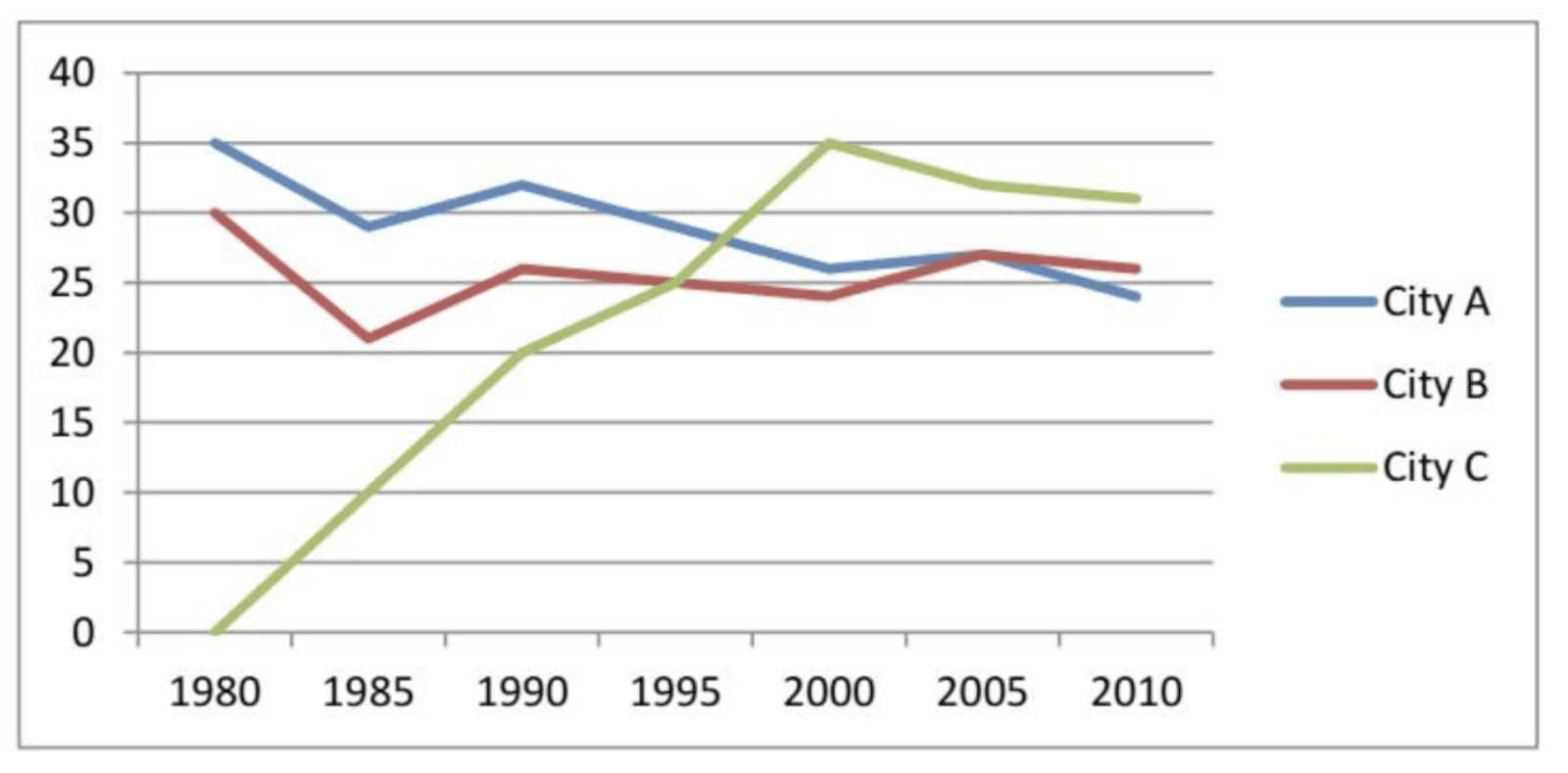
The graph compares the number of international conferences held in three particular venues, including city A, city B and city B, between 1980 and 2010.
Overall, the quantity of conferences taking place in city C showed the most dramatic growth and this city became the most popular conference venue in the final year. By contrast, the figures of city A and B experienced a downward trend throughout the period.
In 1980, it is clear from the graph that there was a noticeable contrast in the rates of conferences among three meeting destinations. City A and B were the most popular meeting venues with 35 and 30 global conferences held there respectively, whereas there was no meeting held in City C. Over the following 20 years, there were more meetings organised in city C and the figure reached a peak of 35 conferences in 2000. After a slight fall to over 30 conferences in 2010, city C ended up the most popular conference venue among three destinations given.
In contrast, city A and city B underwent fluctuations around a downward trend regarding the number of conferences throughout the period, achieving around 24 and 26 conferences respectively in the year 2010.