Sample answer
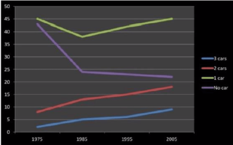
The line graph compares the percentages of car numbers owned per household in the UK between 1975 and 2005.
Overall, it is clear that throughout the whole period, most British households had 1 car and the rates of households owned 2 and 3 cars showed an upward trend. Besides, the greatest change occurred in the figure for household having no car.
At the beginning of the period, the percentage of households with 1-car ownership was the highest, achieving around 45%, while that of 2 and 3-car ownership accounted for only approximately 8% and 2% respectively. After reaching its low at 38% in1985, the rate of households owning 1 car witnessed a recovery, rising gradually but surely for the remaining period. It is interesting to note that the figure for the final year is exactly the same with figure for 1975.
Meanwhile, the proportions of UK households having 2 cars and 3 cars presented a similar upward trend throughout the whole period. It is noticeable that from 1985 the figure for households with 3-car ownership lagged that of households with 2-car ownership by a double margin, and ended the period at around 9% and 18% respectively.
In contrast, the rate of households having no car underwent a rapid drop in 1985, falling to under 25%, and continued to decrease slightly until 2005, standing at approximately 22%.