Sample answer
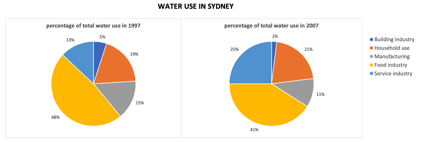
The pie charts give information about the proportions of water consumption in five different sectors in Sydney, Australia, in 1997 and 2007.
Overall, the sector using the highest percentage of water was the food industry. The proportions of water consumption in service industry and household use showed an upward trend in the period given, particularly service industry’s was double the figure for 1997.
It is clear that there were three sectors experiencing a fall in water use in 2007 as compared with the year 1997. To be more specific, the food industry accounted for almost a half of total water use in 1997 but only over 40% in 2007. There was a 4% decrease in water use of manufacturing sector, achieving only over 10% in 2007. The building industry utilised a very small minority of water in both years, decreasing from 5% in 1997 to 2% 2007.
Meanwhile, the service industry witnessed a great growth in water utility, rising from 13% in 1997 to a quarter in 2007. Similarly, the use of water for household activities went up slightly from 19% in 1997 to 21% in 2007.